
Mango Health app redesign
Personal project I took on after downloading the app for my own use.
I wanted to redo a few screens to make it more visually appealing and easier to navigate.
Original app: tinyurl.com/mango-health-app
Prototype of my redesign: tinyurl.com/mango-health-redesign
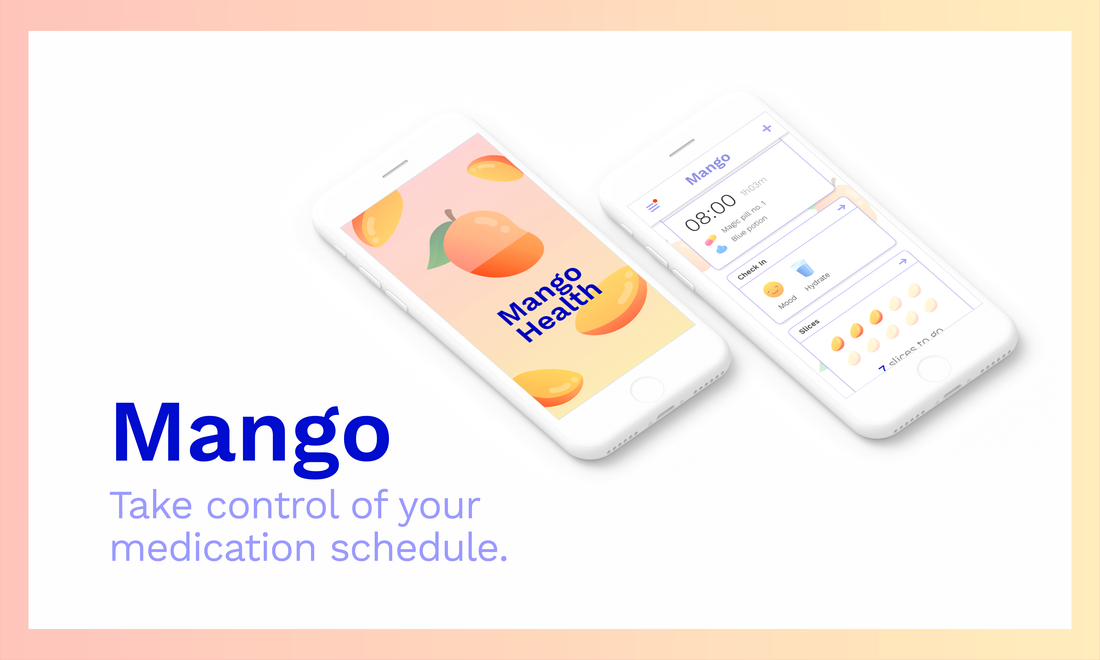
Redesigned promo image
|
Icon
Original icon's white background looked a bit jarring among other apps' icons, and the colors weren’t as eye-catching as I would’ve liked. I thought a health app should have a healthier-looking mango, so I made a new icon in Illustrator.
I tried picking a color that looked more natural against the home screen and redrew the mango to look fresher.
The biggest challenge here was making sure it looked like a mango and not a bean-shaped orange.
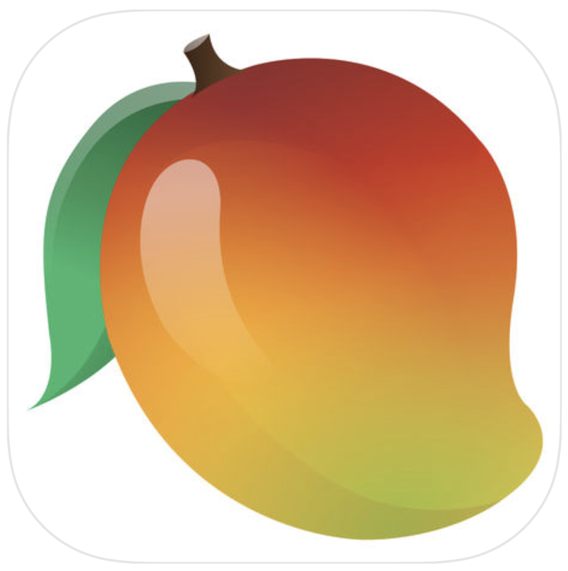
Original icon
|

Redesign
|
Loading screen
I incorporated a more engaging loading animation into the central mango image, with the mango filling up as the app loads. I built the screen in a similar style to the app icon, with a lot of bright colors and soft gradients.
Loading screen
I incorporated a more engaging loading animation into the central mango image, with the mango filling up as the app loads. I built the screen in a similar style to the app icon, with a lot of bright colors and soft gradients.
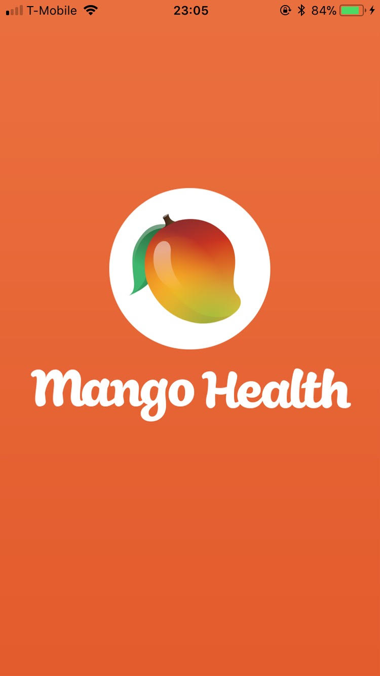
Original loading screen
|
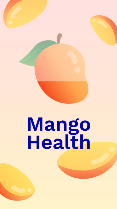
Redesign
|
Menu and dashboard
When I first started using Mango Health, I felt that the user controls were a bit too decentralized.
Its illustrations implied that the app wanted a cheerful design style, which I thought could be reflected better in the dashboard's design and color scheme.
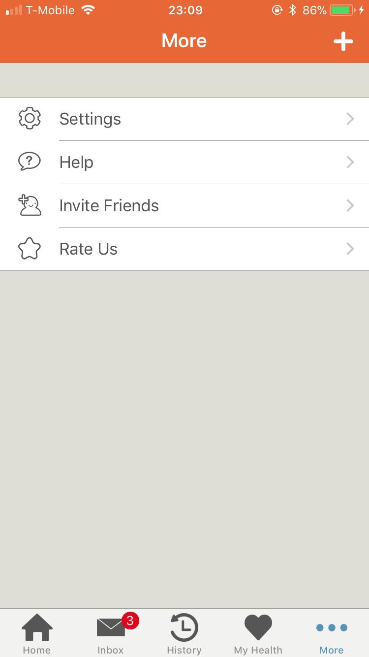
Original menu
|
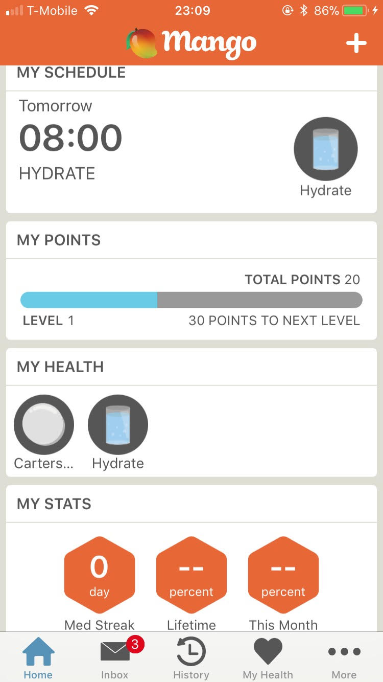
Original dashboard
|
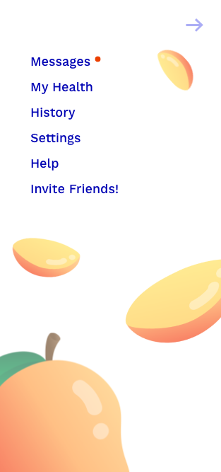
Redesigned menu
|
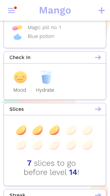
Redesigned dashboard
|
|
I decided to make changes to both the options menu and the dashboard:
|
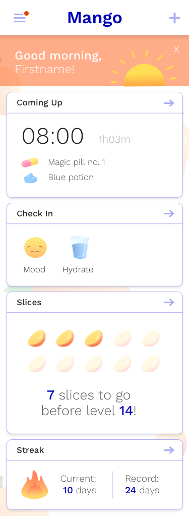
Redesigned dashboard (full)
|

|
Original app: tinyurl.com/mango-health-app Redesign prototype: tinyurl.com/mango-health-redesign Programs - Adobe XD, Illustrator, Photoshop Font - Work Sans |